
Visualize Your Data! New Focus Package on Health COMpass on Data Visualization Materials
 Most of the time when we think about representing numbers in a visual way, we think about things like bar graphs and pie charts. These can be great tools for displaying development indicators, but recent software advancements have created a wealth of additional resources and tips for presenting data in ways that are both visually appealing and easy to understand. This field is called ‘data visualization’, and is loosely defined as the creation and study of the visual representation of data. Those of us who work with data know that it is most useful when widely disseminated and shared with others – and this is where the popular emerging field of data visualization comes in. It focuses on creating data representations that are clear, attractive, and message-driven. Some big players have emerged in this field in recent years, including Edward Tufte, Stephanie Evergreen, Stephen Few, and Hans Rosling.
Data visualization techniques are often seen as an intersection between the fields of graphic design, data analysis, and education. These techniques can help with everything from written reports to PowerPoint presentations. For instance, when making graphs for a written report, you can assume your reader is going to have a lot of time to look at your data and read supporting text to understand it. You can make your visualizations more detailed and complex. When making PowerPoint slides, however, your audience is seeing your visualization for probably only a few minutes. It needs to be big, clear, and simple. Data visualization guru Stephanie Evergreen provides some great examples of how to present data in both written reports and in PowerPoint slides on her blog.
There have been quite a few software packages developed in recent years for data visualization, the most popular of which is probably Tableau. Tableau is available in a free web-based version as well as a desktop package you can purchase. Its key innovation is to provide quick and easy drag-and-drop data visualization technology, and is becoming widespread for both business intelligence and research data visualization.
On the other end of the spectrum is good old Microsoft Excel. Many people are surprised to learn that Excel charts and graphs can look very different than the standard templates provided by Microsoft. However, there are many easy ways to ‘hack’ Excel to make it do more sophisticated visualizations. Ann K. Emery has excellent video tutorials on her website on how to make Excel do more creative and innovative visualizations.
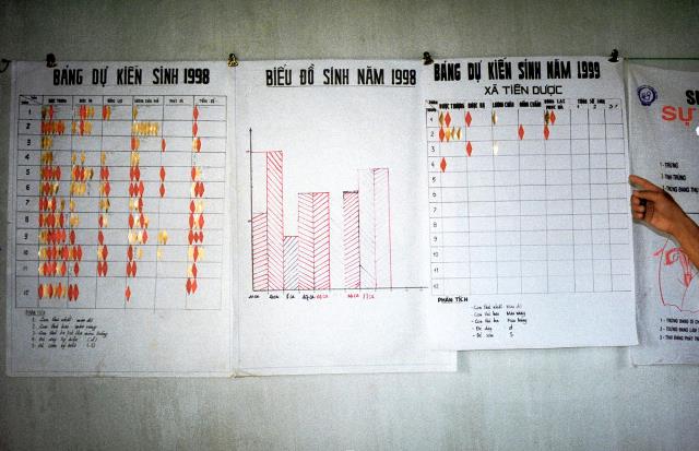
If you think these resources are interesting and helpful, go check out the Health COMpass’ latest Focus Package on data visualization. It presents some high-quality and easy to use tools to help you visualize your data, as well as some examples of how country projects have done this effectively. As you will see, there are many resources out there that will help get your creative data visualization juices flowing!


Leave a Reply
Want to join the discussion?Feel free to contribute!