

Data Visualization: A Tool for Effective Health Communication
“Data is a weapon,” said Julie Whipple, moderator of the Health Communication Capacity Collaborative’s Innovation Webinar on Data Visualization. Data visualization, she explained, can bring together many different sources of data and apply the data as a weapon to improve global health.
This webinar explored how data visualization can be used to convey impactful and compelling evidence that influences behavior change and improves program performance by presenting data in ways that are both visually appealing and easy to understand. This was the fifteenth in HC3’s innovation webinar series, designed to spotlight a broad range of health communication innovations while providing a meaningful mix of theory and practical examples.
Transforming data into accessible information
 Julie Whipple, Global Director of Corporate Social Responsibility at Qlik, moderated the webinar and described data visualization as the combination of “data, people and ideas – and combining the three to find the right solution.” Visualization tools, she said, can transform simple spreadsheets or complex documents into easily accessible information that enables users to find answers. In addition to using data visualization for quantitative data, she described how Qlik participates in the Global Health Security Agenda’s Private Sector Roundtable. In support of this work, Qlik takes detailed assessments submitted in PDF and transforms the qualitative data into visual charts that can quickly convey information and track progress over time.
Relevant, quality data for effective visualization
Maya Tholandi continued the discussion with a description of how data visualization maximized how information was communicated in the Expanding Maternal and Neonatal Survival (EMAS) project, a USAID-funded project in Indonesia to improve outcomes of emergency obstetric and newborn complications. Jhpiego’s approach on this project was to strengthen quality of clinical care, clinical governance and effectiveness of district-wide referral systems.
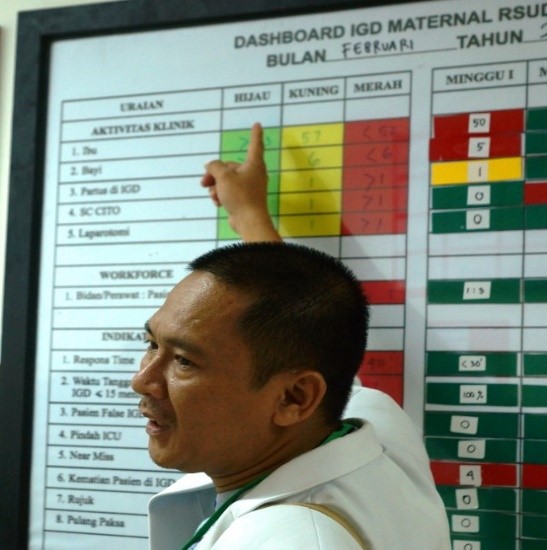
EMAS’ clinical dashboards use a stoplight approach (red, yellow, green) to monitor monthly performance.
Maya stressed that data visualization was not their goal – instead, they wanted to facilitate data use to cultivate a results-based environment. In order to do so, it was critical to understand what information was available, what was needed to inform decision-making and what format the information should be presented in to be most effective. Different products were developed that resonated with different audiences for communication and facilitating data use.
EMAS’ key lesson learned was that having relevant data of sufficient quality was critical for effective data visualization. “Because people trusted data and it was the right data they needed, it helped them act upon it,” she concluded.
Sustainability first
Andrea Vazzano of Palladium addressed the importance of using the data visualizations created and ensuring sustainability. She shared MEASURE Evaluation’s recent evaluation of the use of data visualization that had proven to effect decisions in HIV-programming. Out of 45 interviews conducted, MEASURE Evaluation found only five examples with a specific decision that resulted from data visualization. Looking at how data visualization is institutionalized, Andrea explained, is critical to ensure its actually used to impact policy and programming.
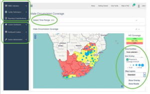
Project SOAR’s GIS dashboard offers extensive functionality to meet the needs of each user.
Project SOAR took these lessons to heart while developing a suite of tools to improve data for decision-making for voluntary medical male circumcision (VMMC) programs. One of these tools, a GIS dashboard, was designed to synthesize and visualize VMMC data for all kinds of users, to improve data integration and make the data more accessible through visualization.
Andrea described three best practices to ensuring lasting use of data visualization. It’s important to consider sustainability first – think about who the end users are, how they are going to be trained and who will continue to be the point person for the visualization products after the end of the project. Next, it’s important to consider your sources. You need to use data sources that people trust and have bought into in order to build something that’s long lasting and will be used continuously. Finally, Andrea noted the importance of engaging early and engaging often. Getting country buy-in before starting to build any tools will ensure they continue to use the tools and contribute to sustainability.
Lessons learned for successful data visualization collaboration
Amanda Makulec, Visual Analytics Advisory at John Snow Inc., concluded the webinar by summarizing key considerations for ensuring data visualization projects are successful and collaborative. She echoed the other panelists by stressing the importance of understanding the audience and asking lots of questions. You need to probe to better understand the questions being asked, she said. Think about who is consuming the information, what they want to know and how they will use it. Because data visualization encompasses a lot of things, its important to speak the same language and know what your team is trying to create. Do all of this at the beginning of the project and focus on the human side of data visualization to ensure the end products are effective, efficient and meet the end-user’s needs.
Specific tips and best practices were also provided to build data visualization skills, create change within your organization and produce successful data visualization products. A follow-up blog with guidance on nurturing your data visualization capabilities will be posted soon, so be sure to sign up for notifications.


Leave a Reply
Want to join the discussion?Feel free to contribute!